LOGO DESIGNS
Time Frame: 2017-Present
Branding, Illustration, Color Theory
A logo is more than a symbol—it’s the foundation of a brand’s identity. It sets the tone, builds recognition, and creates an instant connection with its audience. With experience designing logos across various industries, I’ve helped brands establish their visual identity with designs that are both strategic and memorable. Below are examples of logos that I have created as a freelancer, working in close collaboration directly with my clients.

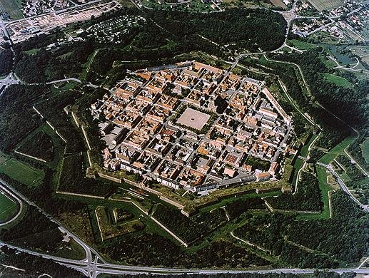
This logo was created for a client in personal training. He is very inspired by the Baroque period in Italy, and desires to cultivate a safe space for his clients to improve themselves. I assisted him in creating the name Stronghold to give the impression of strength and safety, and we created a star shape inspired by the shape of old Italian cities that have protective barriers, and we created a “sigil” that the rulers of these cities utilized. To keep this in the realm of fitness, I chose a sports-style illustration, and selected bold reds to give the brand an energetic feel.

Inspiration - These statuettes are from the Baroque period in France. I presented this in a moodboard to the client, and leaned on it for initial exploration.

Inspiration - This is a city from the Baroque period. There is a series of walls and trenches to add protection to those within, which informed the star shape in the logo.

R1 On-Screens - This was an early concept for this project. I initially looked at a blue color palette to promote trust, and pivoted after client feedback.

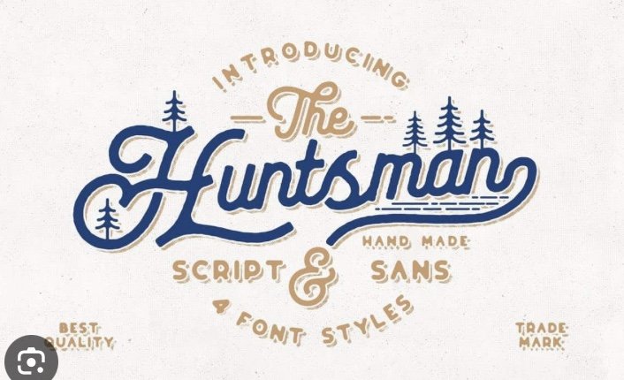
Refresh Cleaning Services is a developing brand in need of a logo re-design. The founder desired a blue logo and a visual that is modern and polished, but not too refined. I decided to balance the use of geometric shapes with organic lines. The addition of a casual script font (without swashes) and a bold sans serif font aids in this. My concept was to give an impression of a “clean cloud”.

Inspiration - I showcased this font in my initial moodboard, which the client loved, and influenced my design.

Rd 1 On-Screen - This is an early logo that I showed the client. The "R" with cleaning services was a great idea for social media which we explored in the final logo deliverables.

Rd 1 On-Screen - This is another color palette exploration moving towards warmer tones as accents. It nods towards "citrus" and balances between femininity and masculinity.

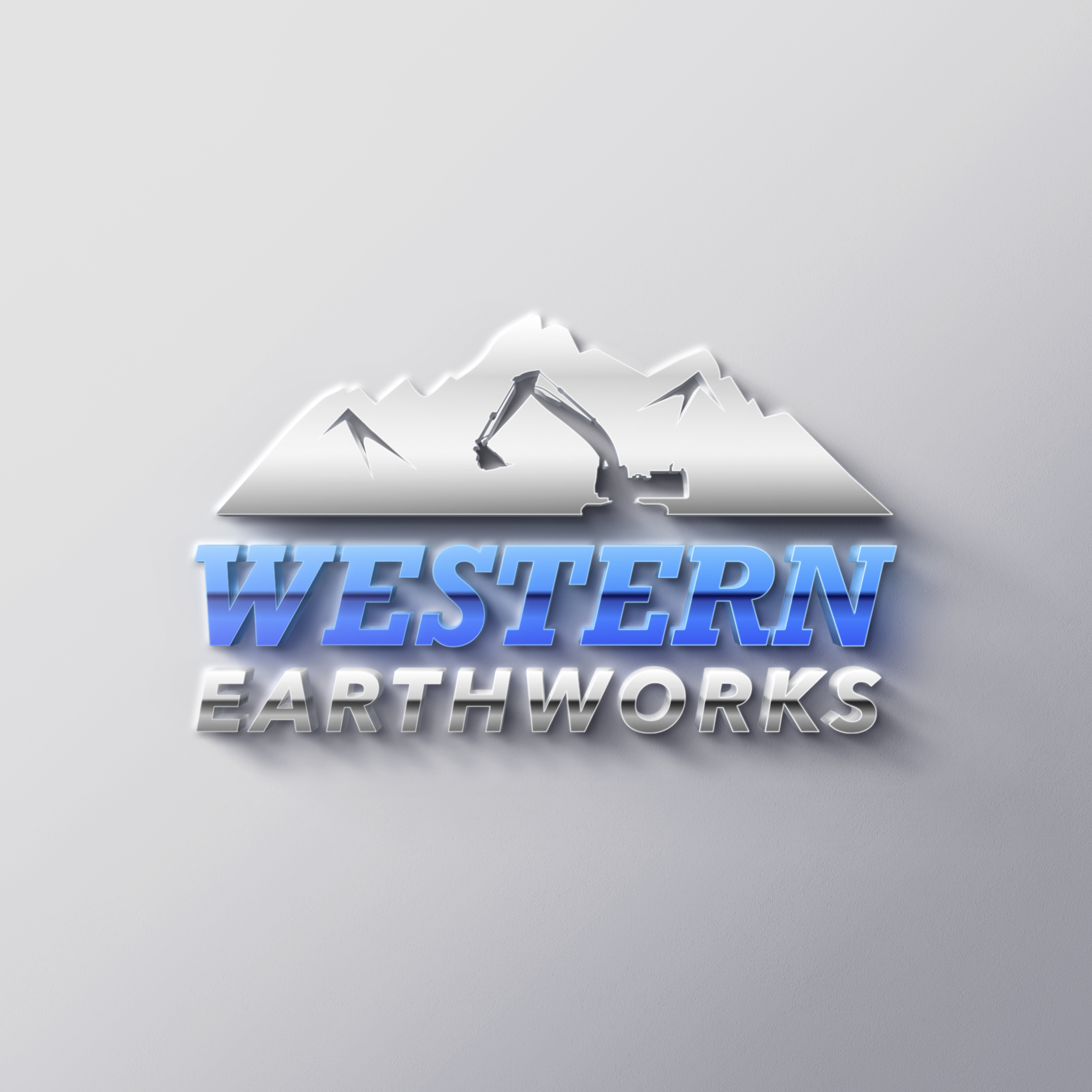
Western Earthworks is a construction company based out in Utah. The logo needed to give the impression of strength, and fit well visually within this industry. I chose to use a metal texture and to use negative space to create depth and interest. A thick slab font was used to give a strong foundation for the icon.

References - We wanted to use imagery from the area that the company is based in to add a layer of familiarity to the logo.

Rd 1 On-Screen - The client wanted to explore using patriotic imagery. I felt this added a layer of complexity that took away from the imagery above, and we settled on using one color.

Presentation Style - I love to show mock-ups of logos to clients in order to add impact and an opportunity to visualize how it would look in real applications.